Web Design Case Study: Blue Dragonfly Group

The Brief
When Angela and Rupert Turton made the bold decision to step away from one of the UK’s largest business coaching franchises, they weren’t just starting a new venture; they were redefining how they delivered value.
Blue Dragonfly Group was born, bringing together two distinct arms of their work: Blue Dragonfly Services and Blue Dragonfly Insights.
The challenge was to create a single online presence that unified both offerings, without losing the individuality, purpose, and personality that made each one successful.
They came to us with a clear vision: clarity, cohesion, and impact.
The Starting Point
![]()
Unlike many projects that begin from scratch, this one had a powerful head start.
Their brand identity (developed by The Pink Octopus) was already strong, distinctive, and full of personality. With established colours, typography, and creative direction, we had a solid foundation to build upon.
This allowed us to focus on something more important: shaping a digital experience that captured the spirit of the brand and would be engaging for users.
The Design Approach
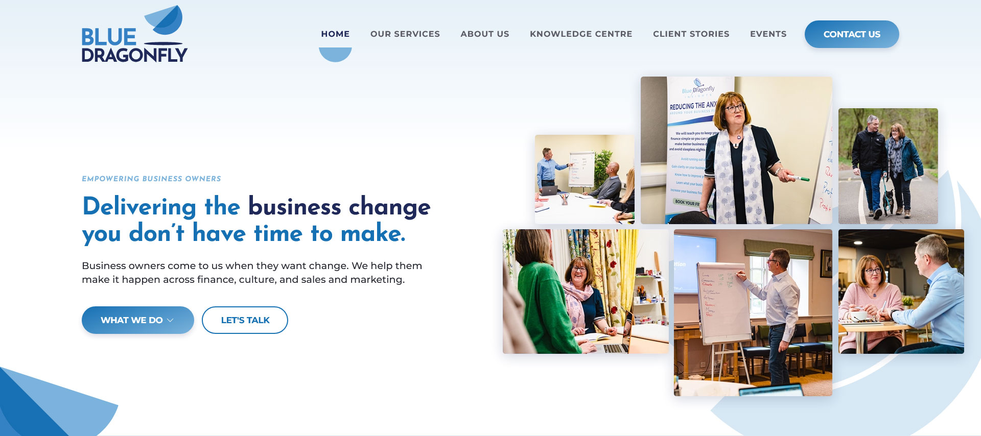
Rather than relying on heavy visuals and oversized hero sections, the client wanted something different - lighter, more open, and effortless to navigate.
The result was a clean, airy design that prioritises:
- Clarity
- Structure
- and User Experience
At its core, the site needed to communicate a bigger message:
Blue Dragonfly Group exists to create meaningful, positive change; helping business leaders achieve both professional success and personal fulfilment.
We also ensured the site reflected their wider impact, particularly their contribution to building a thriving, enterprising economy across the East Midlands.
The Challenge
The most complex aspect of the project was unifying the two sides of the business under one brand without losing their individuality.
Our solution was to create a central “hub” identity for Blue Dragonfly Group, supported by subtle but effective visual cues to maintain distinction:
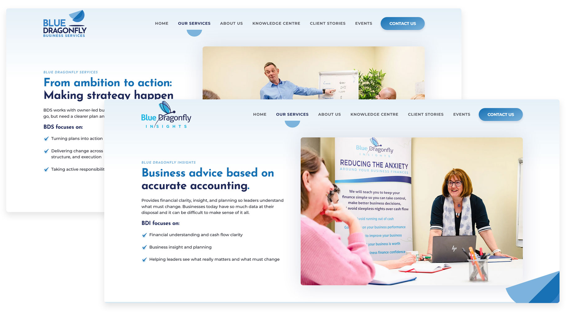
- The primary logo evolved from the existing Services branding to represent the overarching group
- As users move through the site, the identity adapts in real-time:
- On Services pages, the branding shifts to Blue Dragonfly Business Services
- On Insights pages, it transitions to the original dragonfly logo
This creates a seamless experience. One brand, two clear pathways, without confusion or compromise.
The Outcome
The final result is a website that feels:
- Unified but flexible
- Simple yet sophisticated
- Clear, intuitive, and purposeful
Most importantly, it reflects who they are and the impact they create.
The final website effectively combines two complementary businesses into one consistent user experience. It’s clean, easy to navigate, and adaptable, which helps visitors to the site clearly understand everything Blue Dragonfly Group has to offer.
What the Client Said
“Beyond Your Brand did a great job developing our website. The finished site looks excellent, and the whole process was straightforward. Richard O'Donnell guided us through the thinking and structure of the site, making it easy to turn our ideas into something practical. The project moved quickly, and the site was up and running in a very short time.”
Looking for help with your next web design project?
If you’re looking to create a digital experience that truly reflects your business - let's talk.
No pressure, no jargon, just a conversation about what’s possible.
